The semester is over, finals are coming up. The editor of our Local student calls me up and says:
"we needed a cover shot, something 'test related' Oh, and did I mention it's due in five hours? we need to make our printing deadline..."
After a short brainstorming session, I wasn't quite sure what I was going to do, but I knew it was going to involve books... I posted a quick shout-out for modeling volunteers on my Facebook page and headed towards the library.
The head librarian was kind enough to give me free reign to wreak havoc in the humanities library (nobody actually studies there anyhow, I mean, seriously - humanities?).
My Facebook post landed me a student that was hoping front-page exposure would impress the ladies. With everything in place, I was ready to shoot.
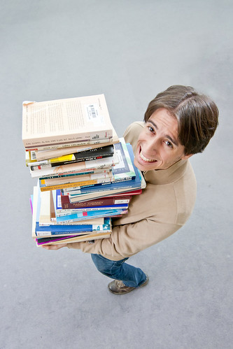
My first concept, which turned out to be the money shot, was a student being "crushed" by the weight of his study material. One thing I didn't consider - is that a stack of books half the hight of an average person - is VERY heavy. Using random books we could only stack to chest height, which was not nearly hight enough. So we set out to find the lightest books in the library.
After gathering a pile of think books printed on cheap paper, I set up two speedlights on both sided of my subject, and shot them straight at the ceiling for simple all-around light. On the bright side, the unexpected weight of the books really helped me get an expression of genuine suffering out of my model :)
The final shot was taken from above, using a wide angle lens. This was made possible by a conviniantly placed staircase. A nice and even background was provided by the libraries grey wall-to-wall carpeting.
The whole shebang: planning, coordination, shooting and post processing was over in less than four hours and, once submitted to my editor, received what I consider the highest possible praise any editorial photographer could ask for: "This is exactly what I had in mind".
If you like, you can see the final publication (Hebrew) here.


No comments:
Post a Comment